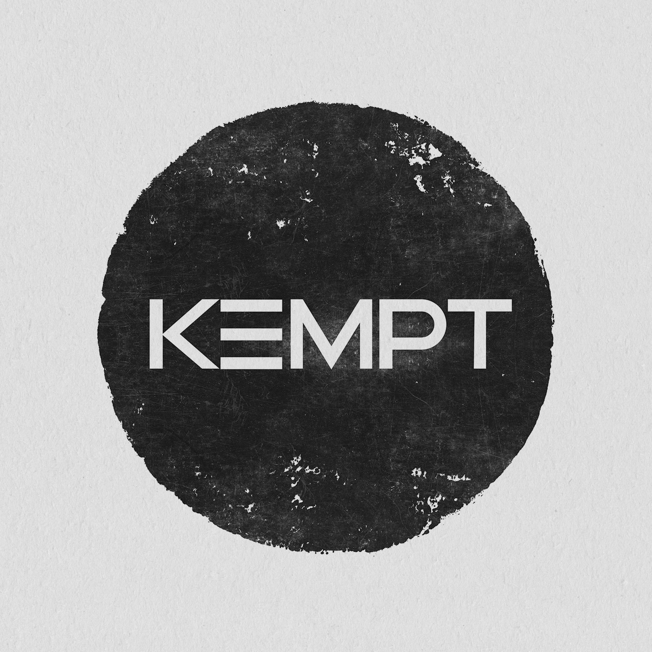
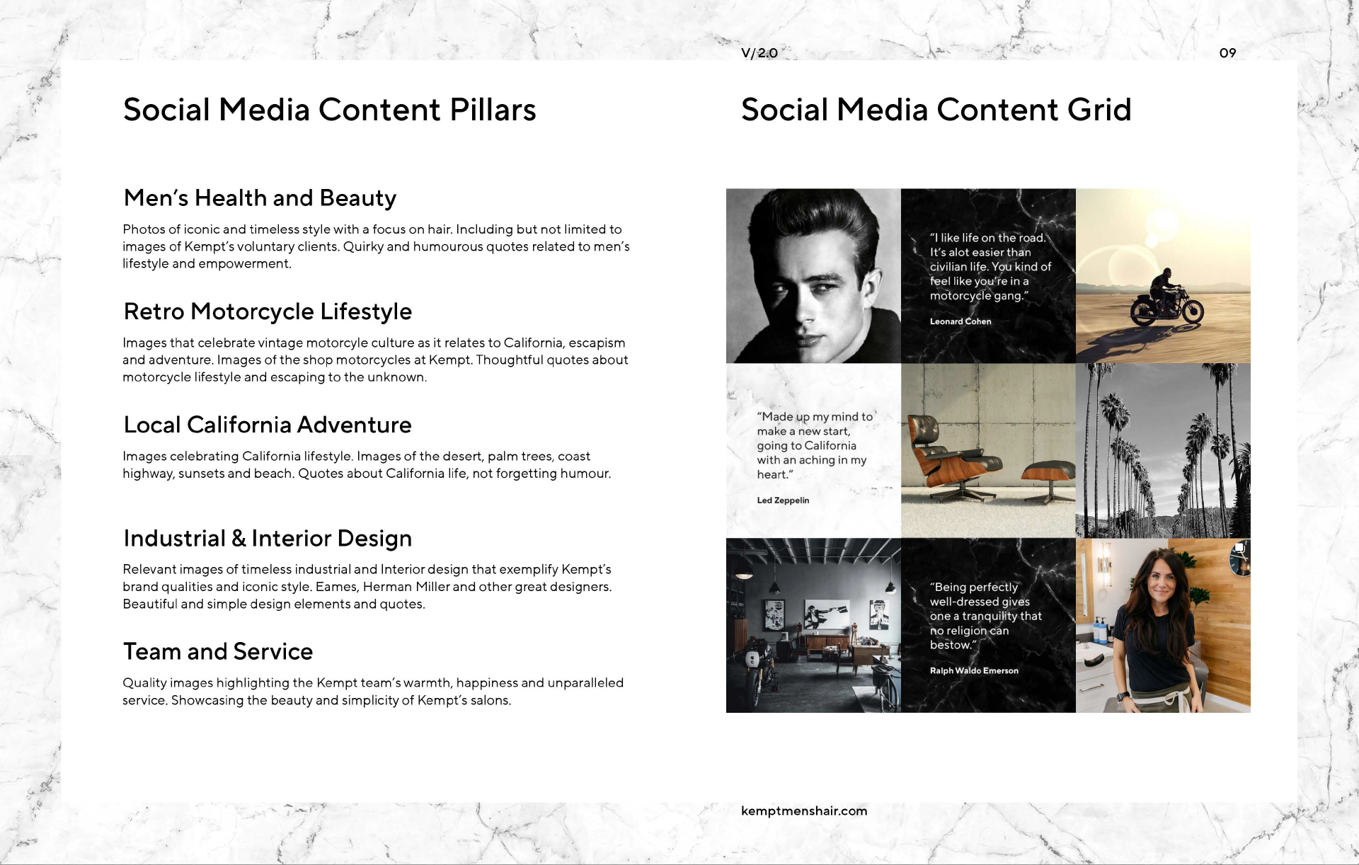
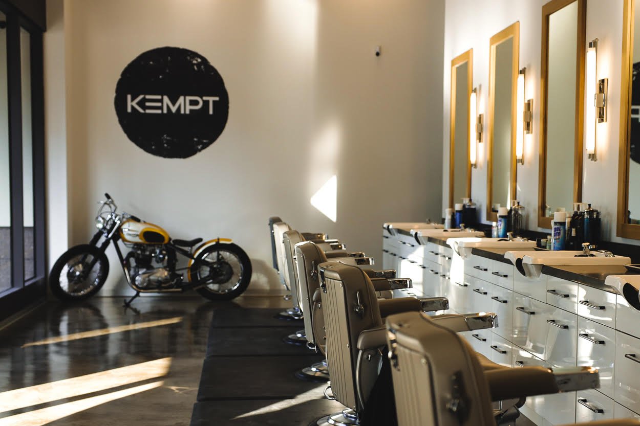
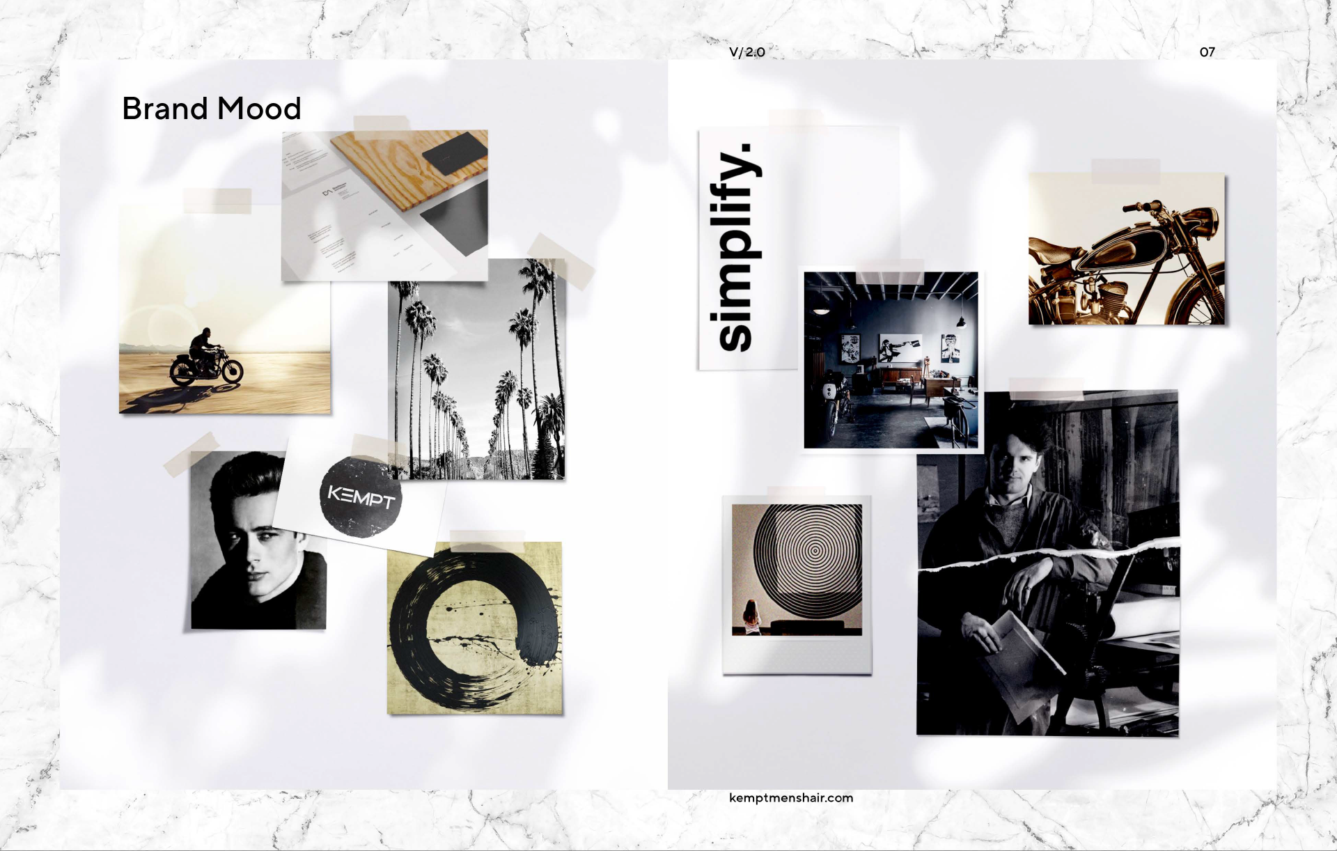
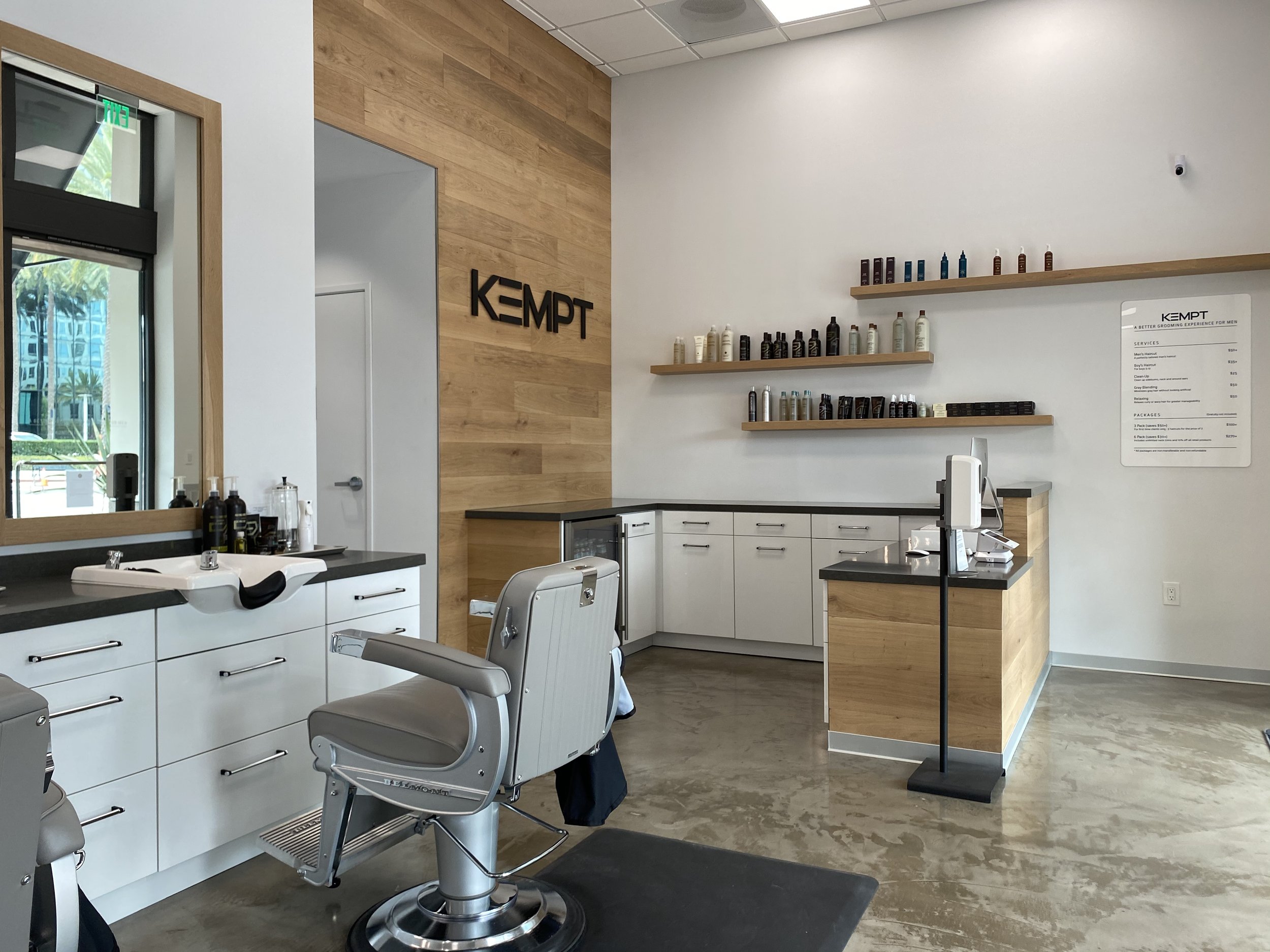
A salon that didn’t want to look like a salon, Kempt is a business designed around men and an elevated grooming experience. We wanted something powerful for their identity, something simple and timeless. Kind of like an old motorcycle. The word mark being the sharp and well kept part. The logo is encapsulated by a stamped, stone like circle with a nod to Japanese iconography.


Services rendered on this project included-
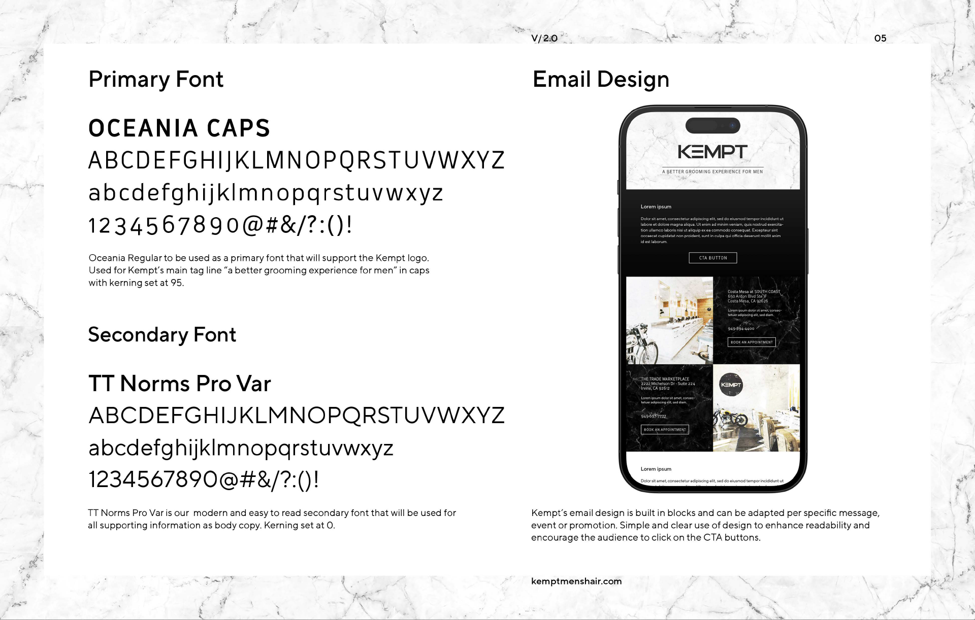
Logo / Identity Design | Brand Guidelines | Signage | Menu Design | Stationery Design | T-shirt Design | Graphic Element Design | Email Template Design